Key Takeaway:
- A color board is a visual tool used by designers to organize and communicate ideas related to color. It serves as a reference guide for selecting and coordinating colors for a specific project, such as branding, interior design, fashion design, or product design.
- There are two types of color boards: physical and digital. Physical color boards are made up of physical materials, such as paint, fabric, and paper. Digital color boards, on the other hand, are created using software tools and can be easily shared and edited online.
- Creativity and intentionality are key when creating a color board. Designers should consider the objective of the project, the target audience, color scheme, color combinations, and draw inspiration from various sources. Samples should be selected and arranged in a way that creates a harmonious and cohesive look. The final color board can be used for various applications in graphic design, branding, product design, fashion design, interior design, and home decor.
What is a color board?

Photo Credits: http:brandingmates.com by Kenneth Flores
To get the idea of a color board, make a visual of your design ideas. You can go for either a physical or digital form. The physical one is a board with painted color swatches, or pins. The digital board is made with software to collect, arrange, and show color schemes.
Types of color boards
Types of Color Boards can vary based on their purpose and medium. Color boards can be both physical or digital, but they are designed to hold a range of colors and color schemes for visual communication.
Here is a breakdown of some types:
| Type of Color Board | Description |
|---|---|
| Mood Board | A collection of images, textures, and colors used to convey the overall feel or mood of a project or brand. |
| Swatch Book | A physical collection of color samples used for product development or referencing in design work. |
| Brand Style Guide | A comprehensive guide that outlines the approved color palette for a brand including primary, secondary, and tertiary colors along with their usage guidelines. |
| Inspiration Board | A collage-like board that collects various images, patterns, and color combinations to inspire creativity in design work. |
It’s worth noting that these categories are not mutually exclusive – swatches can be used on mood boards while inspiration boards may inform the creation of brand style guides.
Depending on the type of board being created, there are different ways to approach it. For example, when designing an interior decorating board, it’s imperative to focus on selecting complementary colors that match furniture pieces and other decorative elements within the room. On the other hand, creating a branding board requires picking up unique hues that will differentiate a brand from its competitors.
To ensure clarity in communication, it’s essential to use accurate color schemes and align them with the target audience’s preferences. Additionally, designers need to consider color psychology when creating these boards as certain colors evoke different emotions in people.
Lastly, while designing digital color boards like Pinterest boards or Photoshop files offer ease & versatility over physical ones where one needs supplies like glue sticks & double-sided tape – organizing samples cohesively is important in achieving successful results irrespective of format chosen for final presentation.
Crafting a visually stunning color board requires a strategic approach involving identifying the objective and target audience, selecting a color scheme, and arranging the perfect combination of colors.
Creating a color board

Photo Credits: http:brandingmates.com by Stephen Harris
Creating a Color Board: A Comprehensive Guide
Selecting the right color combinations for your project requires a lot of brainstorming, inspiration, and planning. A color board is an effective tool that helps in organizing and selecting the right color scheme for your design. This article provides guidelines on how to create color boards for your objective and target audience.
Step-by-Step Guide to Creating a Color Board:
- Gather Samples: Collect a variety of color samples, including paint chips, fabric swatches, or photographs. These samples serve as inspiration for the color scheme of your design.
- Selection: Examine each sample thoroughly and select the dominant colors. Consider the shades, hues, and tints, and how they complement each other.
- Arrangement: Arrange the selected samples on a board, considering the proportion of each color. Experiment with different layouts until you achieve the desired balance.
Choosing a color board is a unique process for every designer, and ensuring the right color palette is critical for your target audience. Creating a color board involves predominantly RGB and CMYK color schemes, and selecting the perfect blend may take time. Persistence and creativity will result in the ideal color scheme required for your design.
True History:
The process of designing a color board dates back to the early 1900s, where people used color wheels to select color schemes. This technique enabled the preparation of a wide variety of colors in a visually harmonious array. The evolution of color theory and technology has significantly influenced the introduction of digital color boards, which allow for instant experimentation and selection of color schemes.
Applications of color boards

Photo Credits: http:brandingmates.com by Steven Jones
When it comes to graphic design, branding, interior design, home decor, fashion design, and textiles, the use of color is crucial. The concept of a color board provides a visual representation of color theories and is often used as a tool by designers to create a cohesive color scheme. Color boards can be physical or digital, displaying swatches and combinations of colors used in a project. They aid in communicating ideas and helping clients to visualize the end result. By utilizing color boards, designers can ensure that their choices are consistent across all aspects of the project.
Color boards are not limited to just design projects, but are also useful in other areas, such as marketing materials or event planning. They help to communicate a specific message or style, making it easy for the audience to understand. For example, a color board for a beach wedding could include shades of blue and soft earth tones to create a serene and calming atmosphere.
In addition, color boards serve as a reference tool for future projects. Designers can refer back to their previous color choices to ensure consistency across all their work. It also helps to save time and effort, especially when working on multiple projects simultaneously.
If you are a designer or in any design-related field, it is essential to understand the importance of utilizing color boards. By not using them, you could miss out on creating a cohesive project that resonates with your audience and clients. So, make sure to incorporate color boards into your design process for the best results.
Examples of effective color boards

Photo Credits: http:brandingmates.com by Edward Taylor
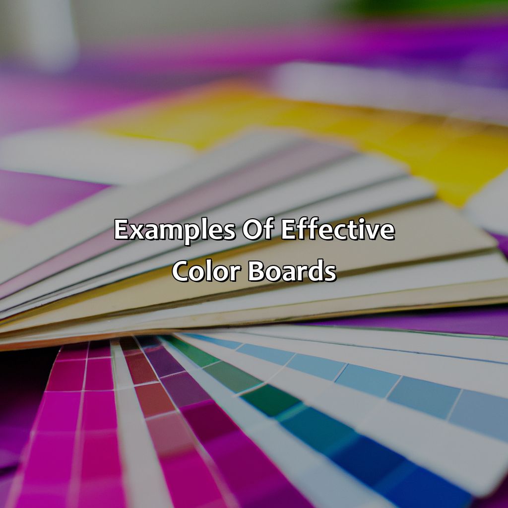
The color board, as a visual tool, can be used to effectively display various color combinations for branding, room design, decor, fashion collections, and products. Below are some examples of effective color boards:
| Column 1 | Column 2 | Column 3 | Column 4 | |
|---|---|---|---|---|
| Branding | Blue, white, yellow | Black, gray, red | Orange, brown, beige | Green, pink, purple |
| Room Design | Neutrals, blues, greens | Warm yellows, oranges, reds | Earth tones, browns, grays | Bold reds, blues, greens |
| Decor | Pastels, whites, grays | Blacks, metallics, bold hues | Neutrals, earth tones, greens | Blues, yellows, pinks |
| Fashion Collections | Soft pink, lavender, mint | Metallics, black accents | Blues, greens, neutrals | Bold red, yellow, orange |
It is important to note that effective color boards should not only consider the desired aesthetic, but also the psychology of color. For example, blue can convey trust and calmness, while red can elicit excitement and passion. By carefully selecting color combinations, a color board can effectively communicate the desired message to its target audience.
A true fact to consider is that color boards have been used by interior designers for decades to showcase color schemes to clients, with notable designers including Kelly Wearstler and Nate Berkus.
Tips and best practices for creating color boards

Photo Credits: http:brandingmates.com by Andrew Thompson
For a captivating, meaningful color board, select the perfect shades and tones. Understand why color theory and psychology are so important. Utilize the right digital tools and software. When finished, show off your work. This will help you communicate your vision clearly.
Importance of color theory and psychology in color selection
The selection of colors in creating a color board is not only aesthetically appealing, but it also involves an in-depth understanding of color theory and psychology. Color theory explains how different colors interact with each other on the color wheel and how individual hues create feelings and emotions. Similarly, color psychology deals with the way humans perceive color and how certain tones influence decisions and behaviors. Both concepts are vital to consider when creating a color board, as they affect the overall harmony and impact of the design.
Color perception varies from person to person depending on cultural background, personal experiences, age, and gender. Therefore, it is crucial to choose colors that align with the target audience’s demographic profile. The right combination of colors can convey specific messages effectively while optimizing visual aesthetics. Moreover, selecting contrasting or complementary colors helps users navigate or standout information within a design.
Accordingly, collaborative elements such as fonts, graphics and images must complement well for overall effectiveness in numerous settings like webpages or corporate branding promotions. Before finalizing a set of colors for a design project on a color board creator program or through cutouts collected from magazines or digital charts take into consideration one’s understanding these aspects to ensure effective communication that creates positive resonance with those intended to receive them.
Colors evoke distinct emotional responses from individuals due to its psychological connection towards an object or brand personality archetype used along various media channels leads to building customer loyalty generating tangible profits over time. For instance, yellow signifies energy optimism generally applied in logos for brands selling products aimed at children as they radiate positivity while grey represents sophistication utilized by many luxury car brands like Mercedes-Benz.
In summary, understanding relevant aspects related to colour values shapes creation through the production phase where boards are created at various stages participating in every adjustment promoting consistent results achieving desired goals without overshooting such as poor user retention bounce rates lowering overall growth stakes tremendously impactful towards business ventures in both online-oriented environment & beyond. Get ready to enter a technicolor dream world with the use of digital color grading tools and software for creating your perfect color board.
Use of digital tools and software for creating color boards
Utilizing Color Grading Software and Tools for Color Board Design
Designers can take advantage of numerous digital color grading software and tools to ensure their color boards are visually cohesive and effective. These tools allow designers to achieve accurate and precise color measurement, evaluation, and correction through the use of colorimetry, color spaces, models, profiles, and space conversion. Creating a table presents the different types of software available for color board design:
| Type of Software | Functionality |
|---|---|
| Adobe Color CC | Create customizable color palettes from photographs or colors manually chosen. Allows users to generate, edit, view, organize, share, import/export Swatch files using various shapes. |
| Paletton | Assists in choosing a basic contrast-complementary scheme based on applied shades. |
| Color Hunt | Offers an exhaustive choice of ready-to-use combinations shared by other designers. |
| Coolors | Generates randomized choices for quick inspiration or allows users to enter manual inputs for fine-tuning. |
Using these aforementioned tools help make designing customized visual solutions more efficient and streamlines the process. Present your color board like a pro and inspire your audience with trending color directions and harmonious color schemes.
Sharing and presenting the final color board
Presenting and Sharing the Final Color Board:
To communicate the color direction effectively, a well-designed color board must be shared with the stakeholders. The final color board should not only reflect the color forecasting trends but also convey how these colors are to be applied.
Here is a six-step guide for presenting and sharing the final color board:
- Prepare a digital or print version of the final color board.
- Highlight timeless, evergreen, trending, and new colors that fit your objective and target audience.
- Ensure you follow essential color harmony rules while selecting colors: monochromatic, analogous, complementary, split complementary, triadic, or tetradic schemes.
- Arrange colors in high-contrast palettes that provide visual interest to your design.
- Clearly indicate subdued or bold elements using muted or bright tones respectively.
- Label pastel, earthy warm/cool tones based on their intended application.
It’s important to include ample inspiration for each featured hue; this will help decision-makers understand how each selected shade was chosen and how it relates to creative execution.
Furthermore, by using easy-to-understand digital tools like Adobe Color CC or Canva that incorporate intuitive export options into their platforms, you can quickly share your completed presentations with relevant stakeholders.
Remember that one size doesn’t fit all! Be sure to tailor every presentation to suit its unique purpose. Whether designing home interiors for clients or pitching new fashion collections that need distinctive branding representation—adapt your approach accordingly!
To create effective color boards requires more than just natural artistic flair; it takes acute observation of customer preferences and careful study of fashion trends following industry experts who have consistently provided accurate color trends for 2021.
For example, a major international brand like Coca-Cola is excellent at maximizing social media platforms such as Instagram when celebrating milestone achievements such as its 125th anniversary. They managed to generate substantial engagement from users by indicating their signature red and creating various illustrations about the history of their iconic color. By crafting such visual narratives, brands can considerably enhance their audience engagement while maintaining core identification.
Five Facts About the Concept of a Color Board:
- ✅ A color board is a physical or digital tool used to organize and plan color palettes for design projects. (Source: Canva)
- ✅ Color boards can include a variety of elements, such as color swatches, textures, images, and typography samples. (Source: Shillington)
- ✅ Using a color board can help ensure design consistency and improve communication between designers and clients. (Source: Creative Bloq)
- ✅ Color psychology plays a role in color board creation, as certain colors can evoke different emotions and convey different messages. (Source: HubSpot)
- ✅ Tools like Adobe Color and Coolors can assist in creating and generating color palettes for color boards. (Source: Envato Tuts+)
FAQs about What Is The Concept Of A Color Board?
What is the concept of a color board?
A color board is a visual tool used to organize and communicate color palettes for design projects. It usually consists of a range of hues, shades, tones, and tints that can help designers to choose the right color palette for their design project.
How to create a color board?
To create a color board, you can start by selecting a main color or color scheme that fits the mood and style of the design project. Then, you can identify other colors that complement the main color or create contrast. You can use various tools like color pickers, color charts, or color generators to find the right shades, tints, and tones. Finally, you can organize the colors on a visual board or digital platform like Adobe Color.
What are the benefits of using a color board?
Color boards offer various benefits for designers, including easy visualization of color combinations, improved color harmony, consistency in color use across different design elements, and efficient communication of color choices with clients or team members.
Can color boards be used for branding purposes?
Absolutely! Color boards are a vital tool for branding purposes as they help in visualizing and communicating the brand color palette, which plays a significant role in brand recognition and recall. A well-designed color board can help to create brand identity and build customer loyalty.
Are there any tools available for creating digital color boards?
Yes, there are various tools available for creating digital color boards, such as Adobe Color, Canva, Color Hunt, and Coolors.
How to choose the right color scheme for a color board?
Choosing the right color scheme for a color board depends on the goals of the design project, the target audience, and the brand personality. There are many types of color schemes, such as monochromatic, complementary, triadic, analogous, and split-complementary. Designers can experiment with different color schemes and identify the ones that best fit the project’s objectives and aesthetics.


